
Everywhere you look, you can see color. Each color makes us feel something, and that is why colors hold the utmost importance for designers. Graphic designers play with colors to create visual content that communicates their ideas or a brand’s message. That is why it’s highly imperative for designers to understand color psychology. Before we get into the essentials of color psychology, let’s see what is meant by it.
Table of Contents
Color Psychology
Color psychology analyzes the effect and influence of colors on people’s perceptions, emotions, reactions, and even decision-making abilities.
We make color-based decisions all the time, without even knowing it. For example, when buying a new product, our purchasing decision is heavily based on its design and colors.
If its colors convey the right sort of message and entice the right sort of feelings in us, we are much more likely to make a purchase.
Now that we know how important color psychology is for designers and marketers alike, let’s take a look at some of its essentials that every designer must know.
Primary colors
Let’s start with the primary colors. As the name indicates, these are the colors from which all other colors are derived. Red, blue, and yellow, are the primary colors.
As a painter, graphic designer, or any professional who has to dabble in colors, you would need to go back to these primary colors time and time again to produce a range of creative hues.
Designers using different animation tools will be aware of the fact that primary colors vary when we talk about color theory with respect to light, CMYK, and RGB. But for starters, let’s stick with red, yellow, and blue.
Secondary Colors
Purple, green, and orange are the secondary colors. These are created from a combination of primary colors.
- Red + Yellow = Orange
- Blue + Yellow = Green
- Red + Blue = Purple
Tertiary Colors
Tertiary colors also known as the two-name colors and are made from the combination of primary colors, but in a way that one primary color is more dominant than the other.
This creates a hue that is more similar to one of the primary colors. Some of the tertiary colors are mentioned below:
- Yellow-orange
- Red-orange
- Red-purple
- Yellow-green
Now that we know about the most basic color combinations and what they are called, let’s move to some of the non-rudimentary blends.
Pure color
You may have noticed that so far this article has not mentioned white or black colors. That is because white and black are not considered to be part of pure colors, i.e., primary, secondary, and tertiary colors.
Pure colors are mixed with white, black, or grays to create the following:
- Tints: Pure color + White = Tint. Also known as pastels, tints are lighter in color, and much less intense than pure colors.
- Shades: Pure color + Black = Shade. Shades are darker in color than pure colors. They range from slightly darker to almost black.
- Tones: Pure color + White + Black = Tone. Tones are less intense versions of pure colors. Tones are used where pure colors are providing too much intensity.
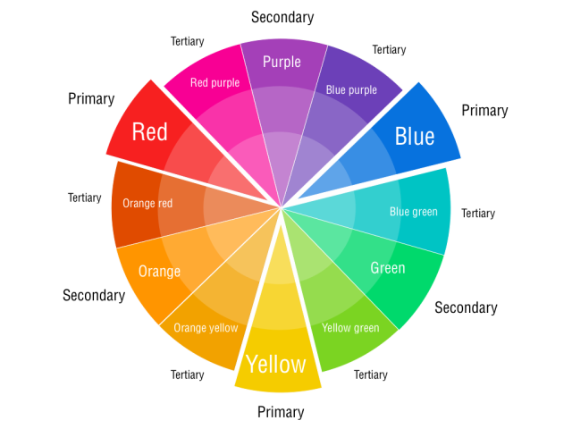
Color Wheel
Following is an image of a complete color wheel. You can see how primary, secondary, and tertiary colors along with their tones, shades, and tints, all come together on it in a unified manner.
Now that we know all about the colors and how they are created, let’s see how they influence people.
Colors, like words, convey certain cues and messages to the onlooker. Design is all about attracting people and conveying the right message through your art. While the right color can attract customers, the wrong one can also do the opposite.
That is why it’s highly important to understand the most common feelings and reactions associated with a certain color to make the right design choices or create the perfect marketing material.
Let’s look at some of the most common colors and what they represent:
Red
Red is one of the most attractive colors out there and represents strong emotions, like love and passion. But red can also represent negative emotions, like anger and danger.
That is why it should always be used in moderation and in line with the design context or the brand message.
Blue
A cult favorite when it comes to brand identity, blue is the color of trust, calmness, and serenity. Blue invokes feelings of reliability and stability.
Businesses that want to project a trustworthy image tend to use blue in their color scheme.
Yellow
Bright as the sun, yellow is the color of optimism and hope. It’s a highly attractive color used to grasp attention from afar.
Like red, yellow should also be used in moderation owing to its intensity.
Black
Black has always been associated with class, power, and sophistication. From black-tie events to funerals, the color black can invoke contrasting emotions like elegance and gloom.
Black is a favorite among exclusive brands that deal in luxury.
Play Around with Colors
When it comes to color psychology, the deeper you go, the more complex it seems. You may feel like making a color decision has become as complicated as a rocket science. Though, that’s not true.
The beauty of colors is that they allow us the freedom to play around with them and find out for ourselves the new colors that can be created. Learn the basics of color psychology, but, at the same time, don’t forget to playfully dabble in colors to create your own aesthetic combinations.