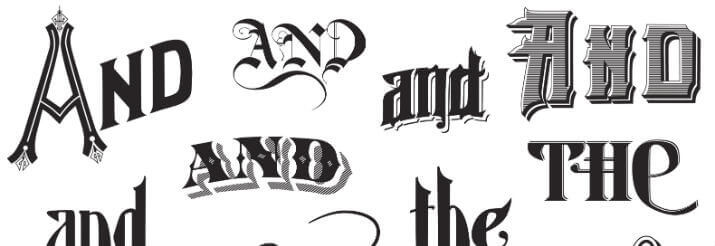
Typography is the way of writing with different types of letters and calligraphy. This is especially important with regard to advertising, marketing, design, art and many other activities in which the visual is essential to attract the attention of the public or generate different reactions in it.
Typography is an art, a form of design that serves to express different sensations, styles, fonts etc. with different shapes of letters and drawings. Typography exists from the very moment that the human being invented writing since we find different forms and letters in Antiquity that varied depending on who wrote, the region, the usefulness of that written document, etc. However, nowadays and especially in the last decades of the 20th century, typography as an art has been developed in a much more systematic way, which tells us about its importance in the world of design, of art.
The word typography comes from Greek, a language in which types means strokes and graphs to write, writing. This means that typography is a way of writing with different traces, styles and designs and this is clearly visible today in advertising, marketing, graphic design, and art, all activities in which the visual weighs heavily and different ways of writing a word, with thinner or thicker strokes, with interlinked letters, with loose and simple letters, with a sans serif fonts or without serif, etc. They generate different sensations in the one who observes them.
This is fundamental in terms of what you want to communicate since a formal text or document will not be the same as a more relaxed, informal and youthful one. The public will feel more appealed to and identified with one form of writing and not another. It is common, for example, to see more formal and serious typography in institutional messages and texts such as those of a medical institute, while in advertisements for teenagers, for example, simpler and more relaxed fonts are used, sometimes even fun.
Although typography seems like a simple art, it is something that requires a lot of work and care because it means that for each new typeface the designer must create a specific design for each letter of the alphabet so that that typeface can be used to write or put together any typeface. word. The fonts must then maintain logic or coherence and follow a similar format according to what is intended to be conveyed in each case.
2 other most used fonts in graphic design
- Helvetica
It is a simple typeface that easily adapts to almost any use, which is why it is considered one of the basic fonts in design. It was created in 1957 by Max Miedinger to improve the Akzidenz Grotesk family. It is one of the most used letters and we can see it in the logos of Jeep, Panasonic, Oral-B, Toyota and Harley Davidson.
- Frutiger
The history of this letter is very curious since it was designed in 1968 for the signalling and signs of the Paris-Charles de Gaulle airport, in France. Its creator was the renowned Swiss typographer Adrian Frutiger with the intention that the ads would be legible despite the distance. This typeface is very versatile and can be used for any size and format.


